Visualization
respyra includes post-session visualization tools for evaluating data quality and participant performance. This page walks through the output and explains how to interpret each panel.
Session summary figure
After running an experiment, generate a 6-panel summary figure:
respyra-plot data/sub-01_ses-001_2026-02-24.csv
Or process multiple files at once:
respyra-plot data/*.csv --no-show
The figure is saved as {csv_stem}_summary.png alongside the CSV.
Example output
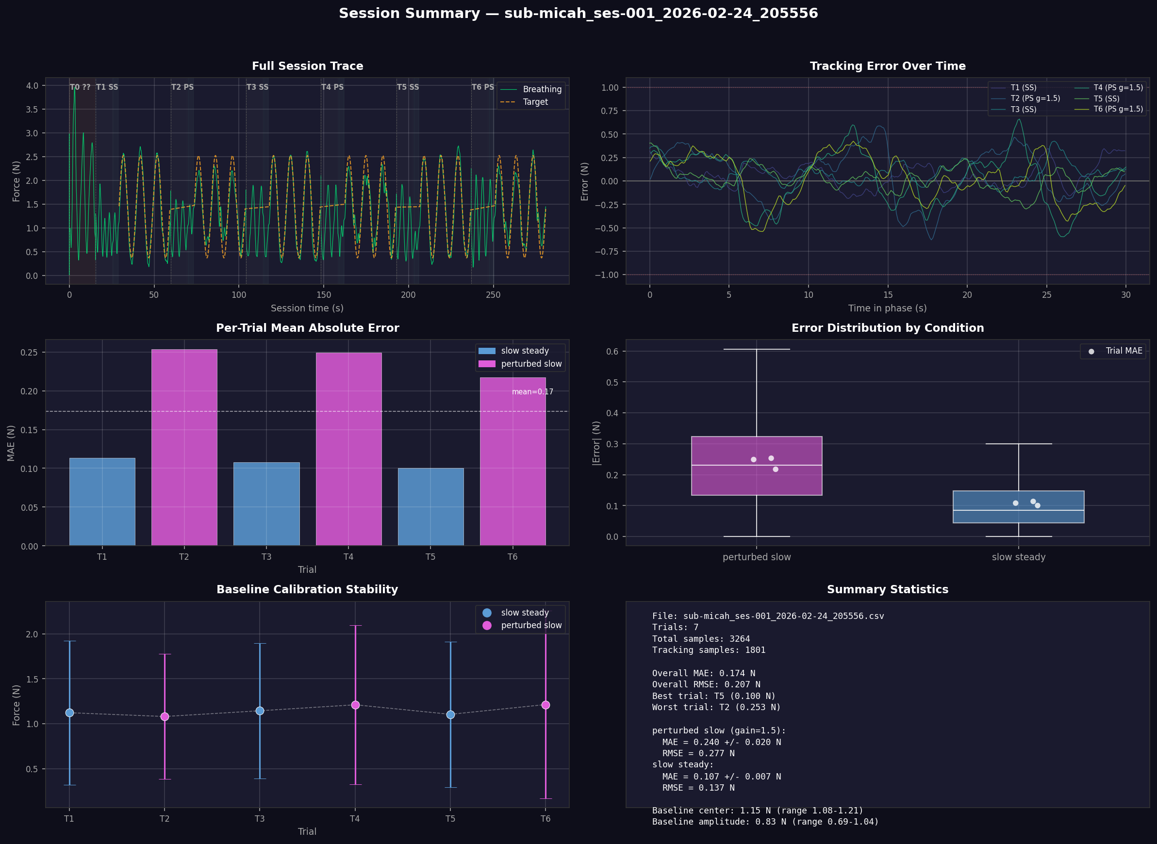
The figure has a dark theme for easy viewing and is organized into six panels described below.
Panel 1: Full Session Trace (top left)
Shows the complete session from start to finish. The green line is the participant’s raw breathing signal (force in Newtons from the respiration belt). The orange dashed line is the sinusoidal target waveform (visible only during tracking phases).
Background shading indicates session phases:
Dark warm brown — range calibration (session start)
Dark indigo — baseline (natural breathing)
Dark teal — countdown (3-2-1)
Near-black — tracking (active task)
Trial labels at the top of each trial segment show the trial number, condition abbreviation (SS = slow steady, PS = perturbed slow), and feedback gain if not 1.0 (e.g., g=1.5).
What to look for:
Consistent breathing amplitude across trials (no progressive fatigue or drift)
Breathing signal tracking the target waveform during tracking phases
Smooth transitions between phases
Panel 2: Tracking Error Over Time (top right)
Shows the signed tracking error (target − actual force) for each trial’s tracking phase, plotted against time within the phase. Each trial is a separate colored line.
The horizontal dashed lines at ±1.0 N mark a reference threshold. Zero error means perfect tracking.
What to look for:
Errors centered around zero indicate unbiased tracking
Systematic positive or negative drift suggests the participant is consistently breathing too shallow or too deep relative to the target
Error reduction over time within a trial indicates within-trial learning
Larger error variance in perturbed conditions (gain ≠ 1.0) is expected
Panel 3: Per-Trial Mean Absolute Error (middle left)
A bar chart showing the mean absolute error (MAE) in Newtons for each trial. Bars are color-coded by condition (blue = slow steady, magenta = perturbed slow). The dashed white line shows the overall mean across all trials.
What to look for:
Lower MAE = better tracking performance
Perturbed conditions typically show higher MAE than veridical conditions
Decreasing MAE across trials of the same condition suggests learning
An unusually high single trial may indicate a distraction or belt slip
Panel 4: Error Distribution by Condition (middle right)
Box plots showing the distribution of absolute error across all samples for each condition. White dots overlaid are the per-trial MAE values (from Panel 3), providing a trial-level view on top of the sample-level distribution.
What to look for:
Median error (white line in the box) should be relatively low for good tracking
Wide boxes or long whiskers indicate high variability in tracking precision
Condition differences: perturbed conditions should show larger errors
Per-trial dots clustered together indicate consistent performance; spread-out dots suggest variable performance across trials
Panel 5: Baseline Calibration Stability (bottom left)
Shows the center ± amplitude of the participant’s natural breathing during each trial’s baseline phase. The center (dot) is the midpoint between minimum and maximum force, and the error bars extend to the breathing range extremes. A dashed white line connects the centers to reveal drift.
What to look for:
Stable centers across trials mean the belt hasn’t shifted and the participant’s resting breathing is consistent
Drifting centers may indicate belt slippage, postural changes, or progressive relaxation/fatigue
Consistent amplitude (error bar length) indicates stable breathing depth
If centers drift substantially, the per-trial baseline recalibration compensates for this in the tracking target
Panel 6: Summary Statistics (bottom right)
A text panel with key metrics:
File and trial count
Overall MAE and RMSE averaged across all trials
Best and worst trials by MAE
Per-condition breakdown with MAE ± SD and RMSE, including feedback gain for perturbed conditions
Baseline calibration summary — center and amplitude ranges across trials
Programmatic use
The visualization functions can also be used in Python scripts or notebooks:
from respyra.utils.vis.plot_session import load_session, plot_session

df = load_session("data/sub-01_ses-001_2026-02-24.csv")
fig = plot_session(df, "data/sub-01_ses-001_2026-02-24.csv")
fig.savefig("my_summary.png", dpi=150, facecolor=fig.get_facecolor())
Individual analysis functions are also available:
from respyra.utils.vis.plot_session import compute_trial_stats, compute_baseline_cal

stats = compute_trial_stats(df)   # per-trial MAE, RMSE, sample counts
cal = compute_baseline_cal(df)    # per-trial baseline center and amplitude
See the API reference for full documentation of all functions.